
Immaculate Auto Detailing
Website Redesign for a Small Business
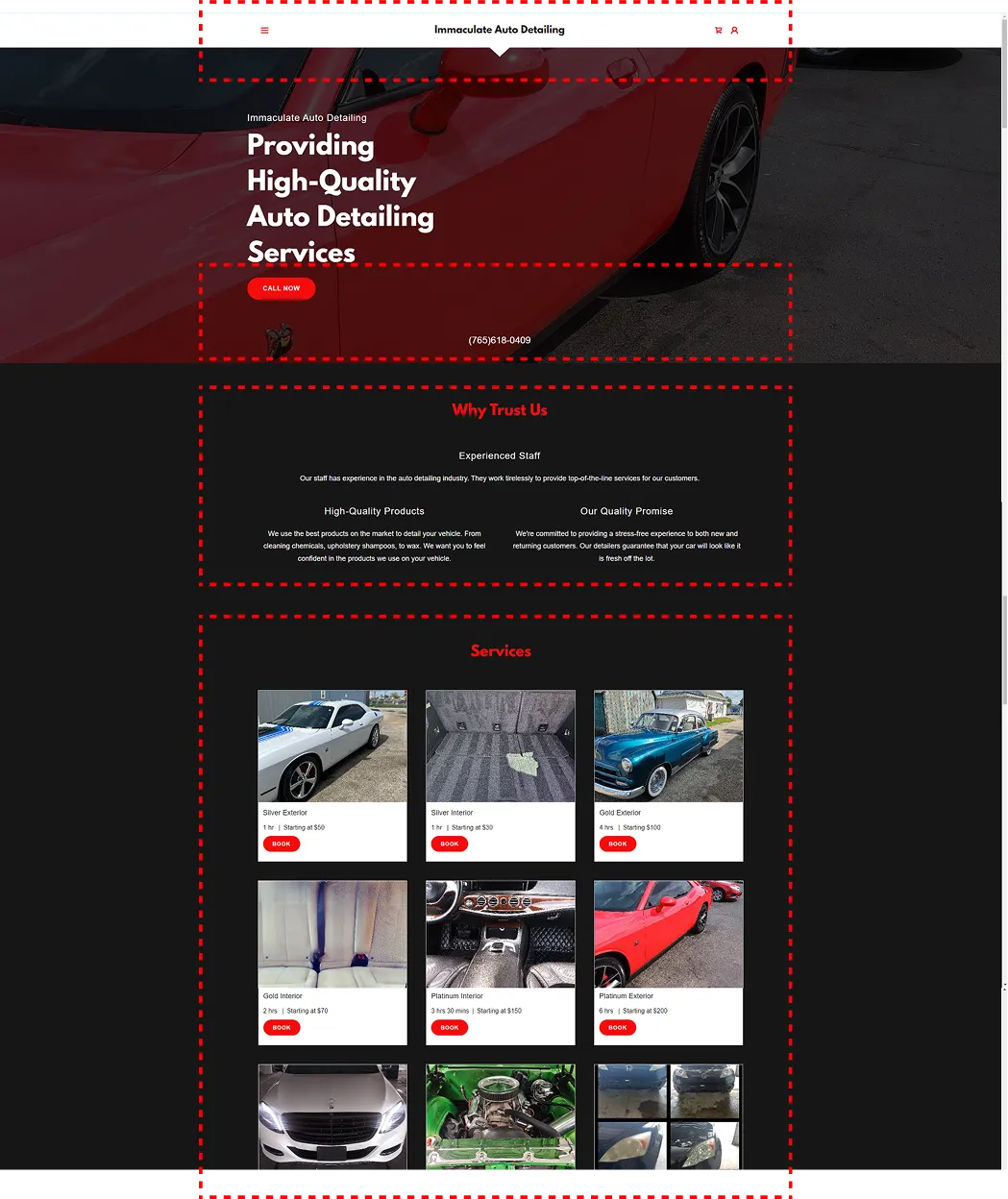
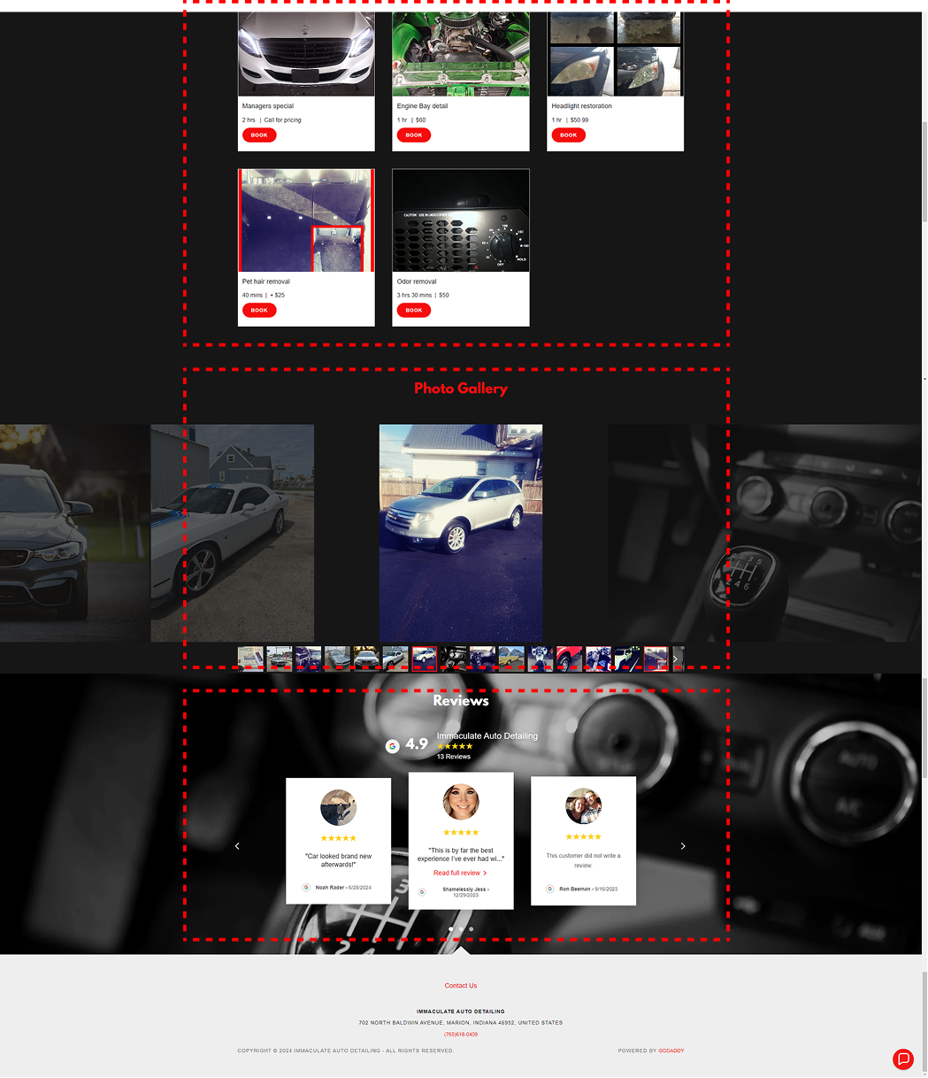
.webp)

Project Overview
Creating a modern, accessible website for a local car detailing startup that wanted to connect more deeply with its community.
Overview:
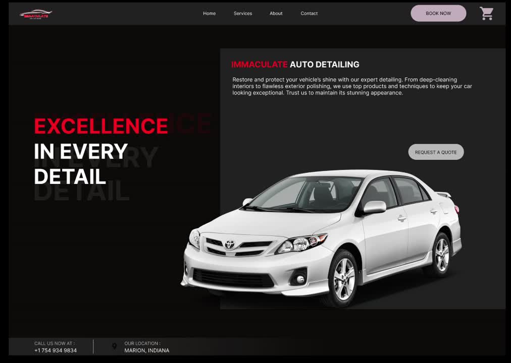
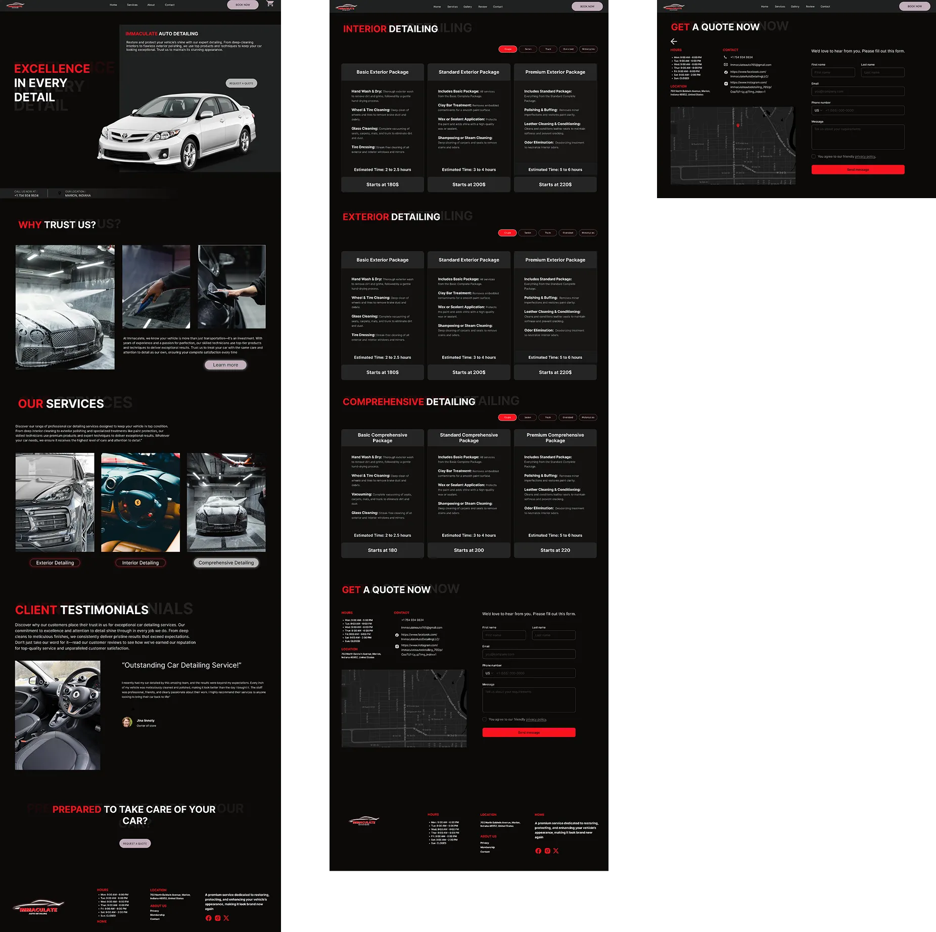
For this project, I led the full redesign of Immaculate Auto Detailing, a small-town detailing service whose existing site was outdated and inaccessible. The new design focused on improving accessibility, simplifying navigation, and creating a seamless booking experience for a wide range of users, from retirees to busy parents. By emphasizing clarity and trust, the redesign aimed to better reflect the business’s community values while increasing customer engagement.
Key responsibilities:
Outcome:


Problem Space
How might we design a website that is inclusive, easy to navigate, and reflects the values of a local, community-oriented business?
The original website was visually outdated and difficult to use. Small fonts, poor color contrast, and a cluttered layout created accessibility barriers, particularly for older users. Navigation was confusing, making it hard to find pricing or booking options.
The site wasn’t optimized for mobile, leaving out users who accessed it on phones or tablets. Most importantly, the brand’s community-first nature wasn’t represented online, leaving a gap between the business’s real-world reputation and its digital presence.
1. Inconsistent color theme
2. Poor accessibility contrast
3. Text hierarchy unclear
4. Call to action infeasible
5. layout inconsistency
6. Lack of proper navigation
7. Confusing Content & Messaging
1. Inconsistent color theme
2. Poor accessibility contrast
3. Text hierarchy unclear
4. Call to action infeasible
5. layout inconsistency
6. Lack of proper navigation
7. Confusing Content & Messaging

1. Inconsistent color theme
2. Poor accessibility contrast
3. Text hierarchy unclear
4. Call to action infeasible
5. layout inconsistency
6. Lack of proper navigation
Project Approach
Over 12 weeks, I led the redesign process end-to-end, focusing on creating a clean, modern, and community-driven experience.
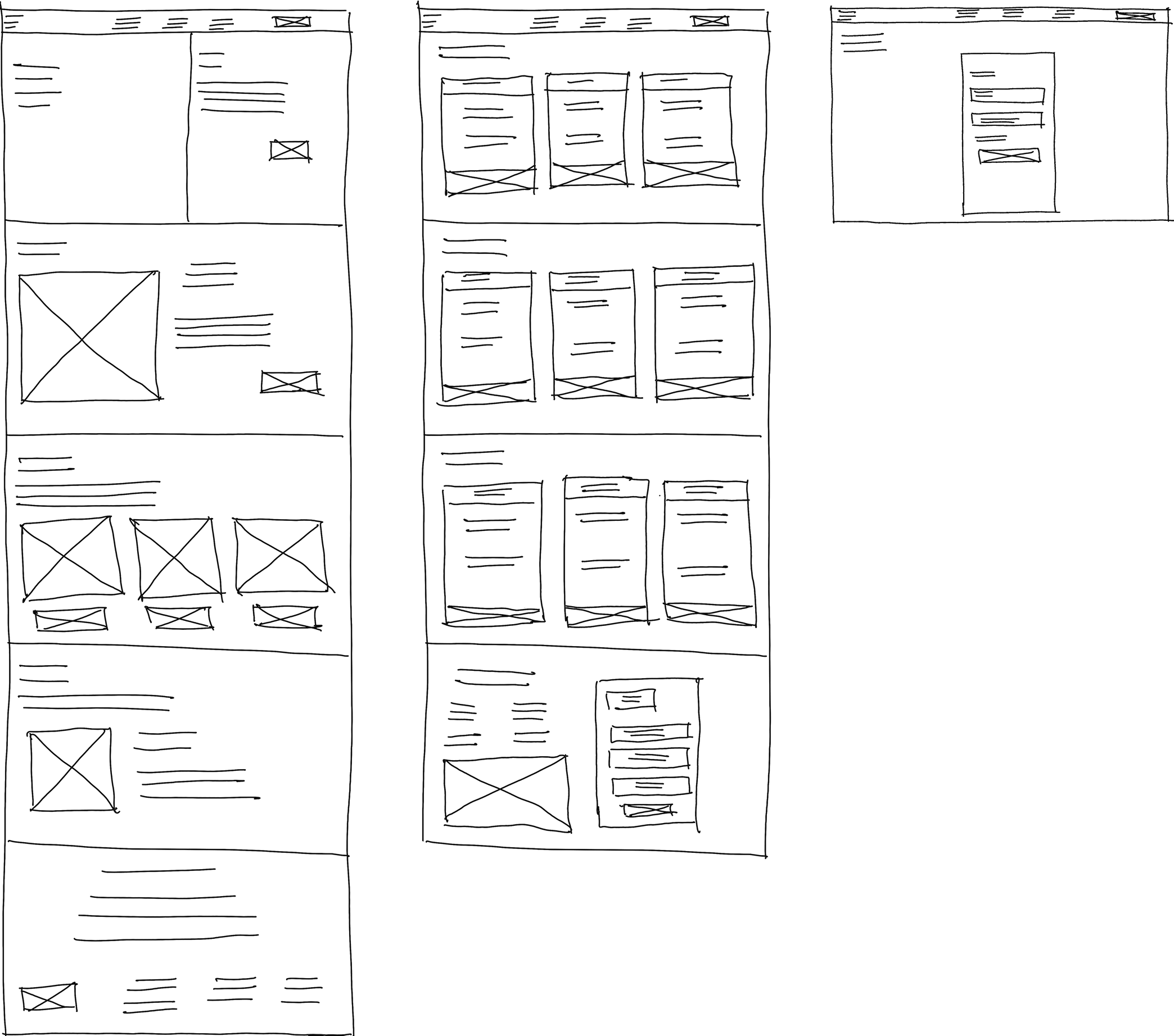
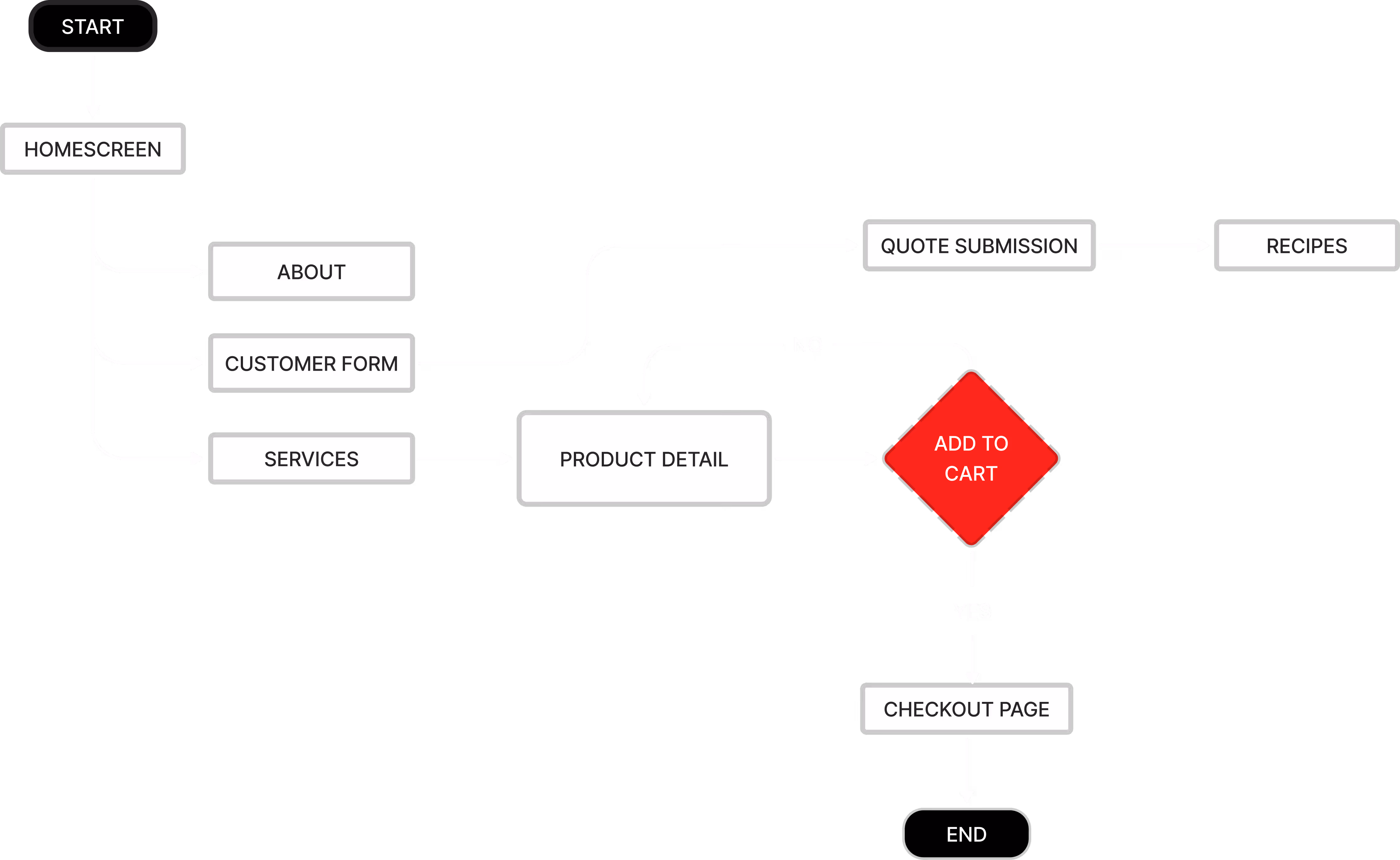
My process started with evaluating the old site, conducting surveys to understand local user needs, and performing competitive analysis on similar service providers. Based on these insights, I mapped user journeys, designed wireframes, and created high-fidelity responsive prototypes. Iteration was driven by accessibility testing and peer feedback to ensure the design worked across devices and comfort levels.
Timeline:
- 2 Weeks: Research, surveys, accessibility audit
- 3 Weeks: Wireframing and IA mapping
- 4 Weeks: High-fidelity UI design and prototyping
- 2 Weeks:Usability testing and iteration
- 1 Week: Final delivery and documentation

User Exploration
Surveyed locals to uncover frustrations with navigation, booking, and accessibility.
Problem Definition
Framed key issues: unclear pricing, poor contrast, and no mobile optimization.
Ideation + Design
Built wireframes for simpler booking, clear hierarchy, and responsive layouts.
User Testing
Validated prototypes; refined buttons, contrast, and booking confirmation.
Iteration + Delivery
Delivered accessible, improved high-fidelity designs.
Research
Exploring how small-town users engage with service websites and where frustration arises.
To ground the design in user needs, I surveyed local residents and audited the existing site against WCAG accessibility standards. I also reviewed competitor websites to identify best practices for service clarity, pricing, and booking flows. The findings reinforced the importance of mobile-first design, simple navigation, and transparent service descriptions.
This research aimed to validate my assumptions on:
- Accessibility as a key factor for older users.
- The role of mobile usability in driving bookings.
- The importance of clear, transparent pricing for trust.
- The need for flexibility in booking methods (online, phone, walk-in).
.webp)
Exploring Solutions
I focused on translating these needs into simple, accessible, and trustworthy solutions.
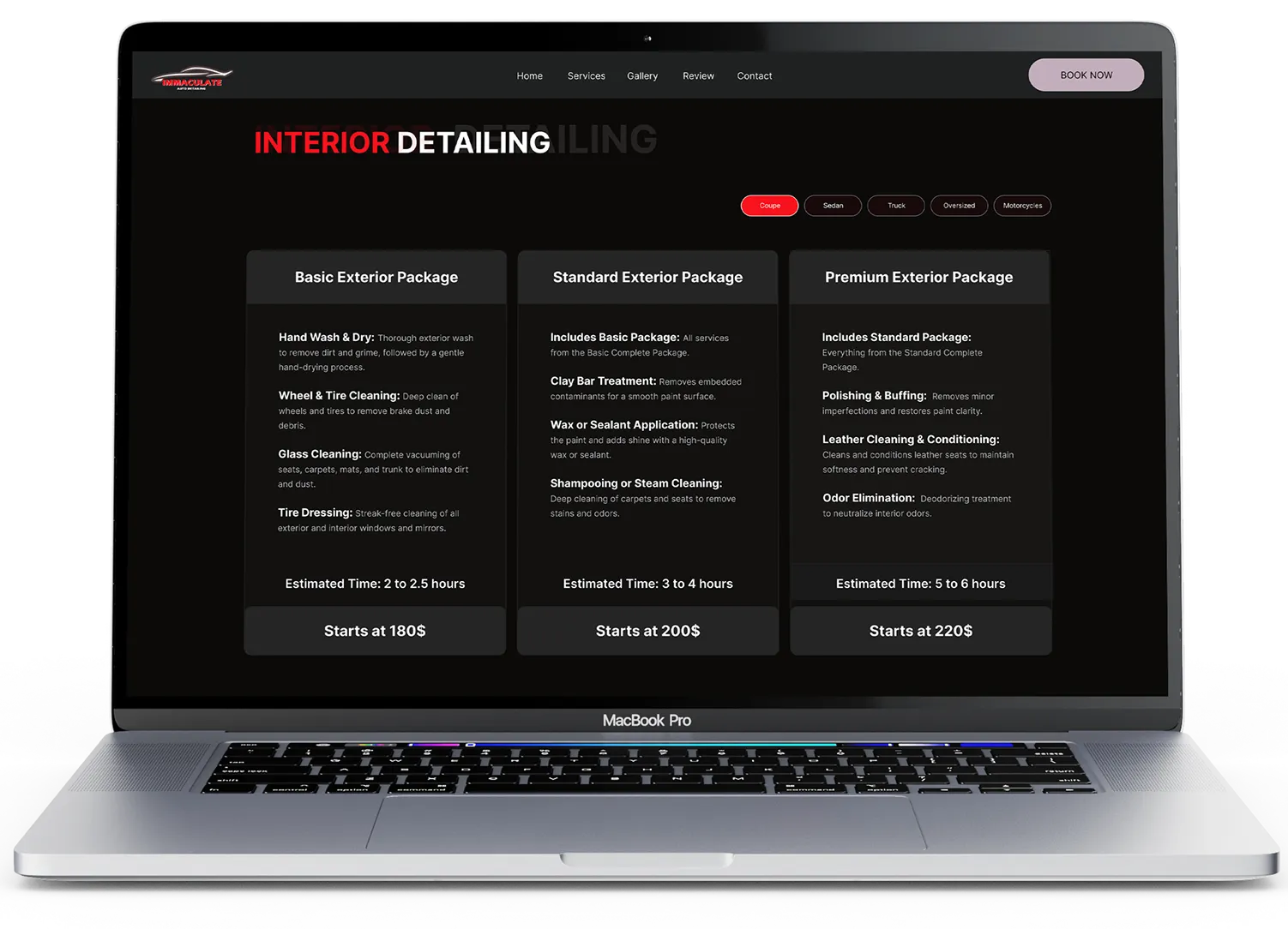
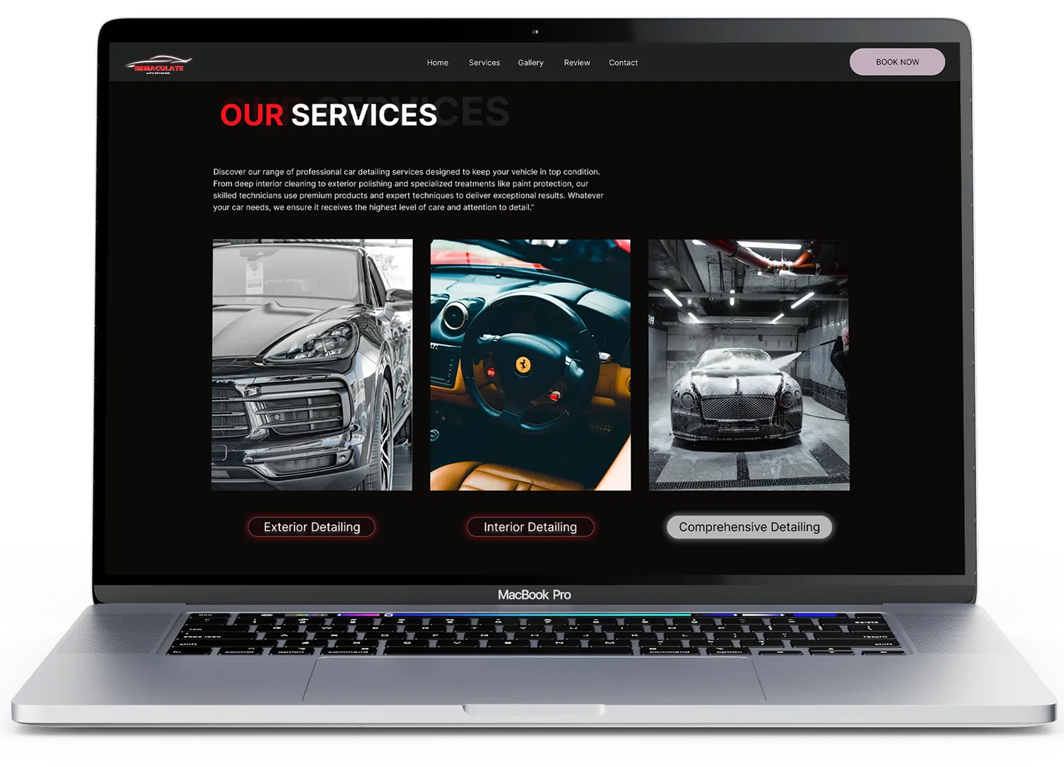
Solutions included:
- Streamlined booking flow: Multiple options (online, phone, in-person) with clear CTAs.
- Accessible design: High-contrast typography, simplified layout, and mobile optimization.
- Transparent pricing: Clear service packages with upfront pricing.
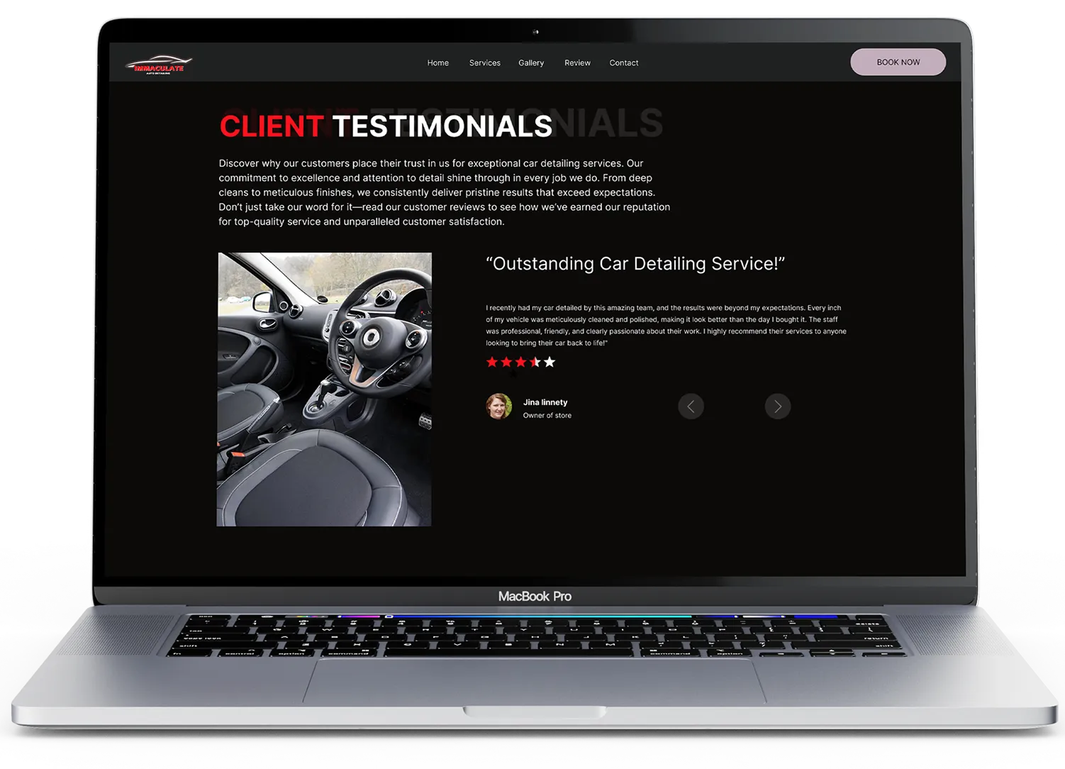
- Community-building: Testimonials and loyalty programs integrated into the homepage.
- Scalable system: A modular design system for easy maintenance and updates.
Design Challenges
One of the main challenges was balancing modern design patterns with the needs of tech-averse users.
The site also had to look professional without the budget of a large marketing team, meaning every element had to serve a purpose. Ensuring consistency across devices and browsers was critical, as was aligning the business owner’s goals with users’ demand for clarity.
Key Challenges:
- Balancing modern UI with low-tech familiarity.
- Designing for accessibility and WCAG compliance.
- Keeping the site professional on a lean budget.
- Ensuring consistent responsiveness across platforms.

Solution
The final solution was a community-focused, accessible website that balanced clarity with professionalism.
Key features included a multi-channel booking system, transparent service descriptions with pricing, and accessibility-first design choices. Testimonials and loyalty sections reinforced trust, while a clean, mobile-responsive layout ensured users could complete tasks effortlessly across devices.
Metrics + Learnings
While the startup did not launch the redesigned site, the project highlighted the potential for significant business and user impact.
Metrics & Engagement (projected):
Future Development & Feasibility:
If launched, the MVP could expand to include a customer portal, appointment reminders, and loyalty rewards. The design system was scalable, offering a framework other small businesses could adapt to strengthen digital trust and accessibility.
.webp)
